
An interactive Shiny app visualizing political party positions, 2024

An interactive Shiny app exploring political attitudes with a focus on Europe


A statistical re-analysis of racial bias in Italian football, with graphs and code


An interactive Shiny app visualizing changes in mobility across the world since the beginning of the COVID-19 pandemic. And this is a version for provinces in the Netherlands
.png?raw=true)
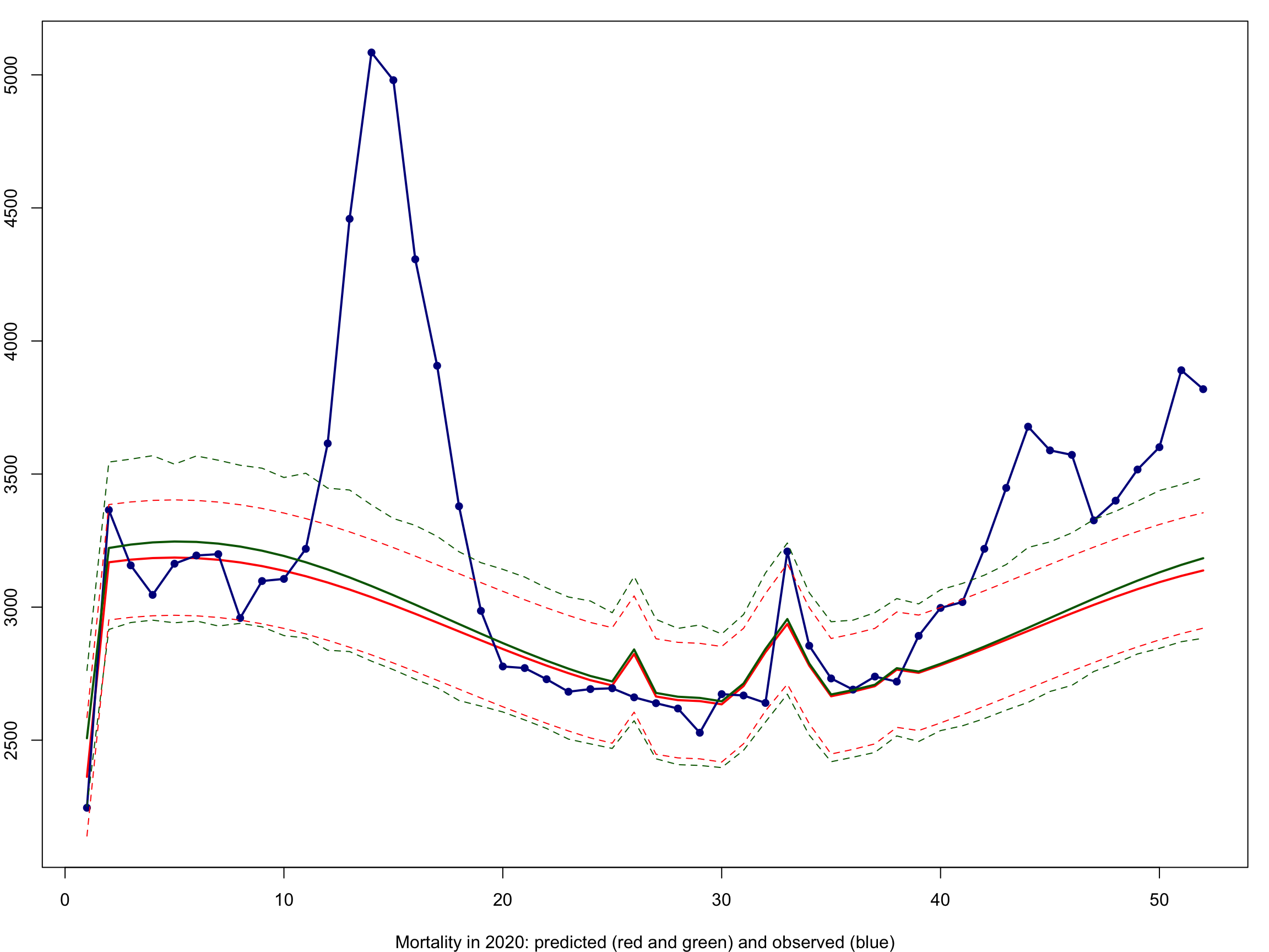
A series of charts showing the effect of COVID-19 on excess mortality in the Netherlands during 2020

A collection of graphs exploring the effects of public policies on the COVID-19 pandemic

A short tutorial on how to make neat visualizations of survey data with base R

Exploring 30 years of socio-economic developments in Central and Eastern Europe

Time-series plots of the evolution of EU legislative productivity between 2004 and 2019


A long post on understanding the political and policy preferences of citizens and parties, with a focus on visualization and spatial representation.

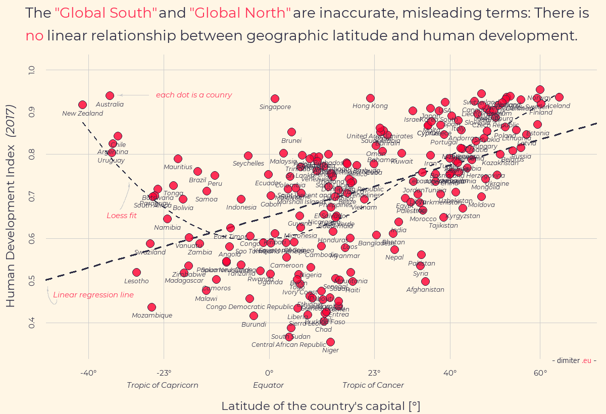
These graphs explore the political geography of development and show why the increasingly popular terms Global South/Global North are inaccurate and misleading.
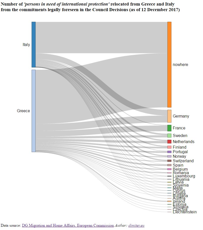
This graph illustrates the (non)implementation of the EU's decision to relocate asylum-seekers from Italy and Greece to other EU member states.
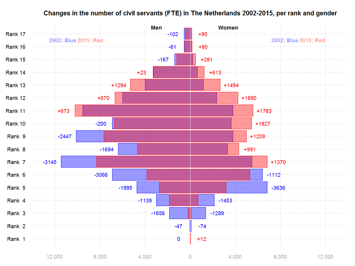
This presentation reviews the changes in the number and composition of the Dutch civil service in the period 2002-2015 in 10 sections, 4,000 words, and 18 figures. It explores the changing face of the civil service in The Netherlands across gender, age, seniority, and other important dimensions.

This project illustrates the results of predictive Bayesian models of electoral outcomes and visualizes the changes in political preferences in Bulgaria. Using a combination of static plots generated with R's ggplot2 and dynamic graphs done with java's dygraphs. I present the current state and the recent changes in political party support and the electoral forecasts derived from this data. The data that is visualized is based on statistical Bayesian models that aggregate and adjust raw survey data.
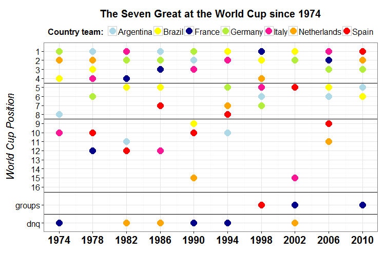
The world is football again! On this wonderful occasion, enjoy a set of visualizations of the results of the FIFA World Cup since 1974, with a focus on the four semi-finalists - Argentina, Brazil, Germany, and The Netherlands.
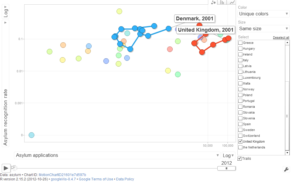
This dynamic (motion) chart below shows the number of received asylum applications and the asylum recognition rates for 29 European countries over 12 years. The chart illustrates not only the differences in the asylum flows of the European countries of asylum destination, but makes it possible to trace and compare the experiences of individual states. The dynamic plot is done with Google Chart Tools via the googleVis library in R. The code and data are available here and here.
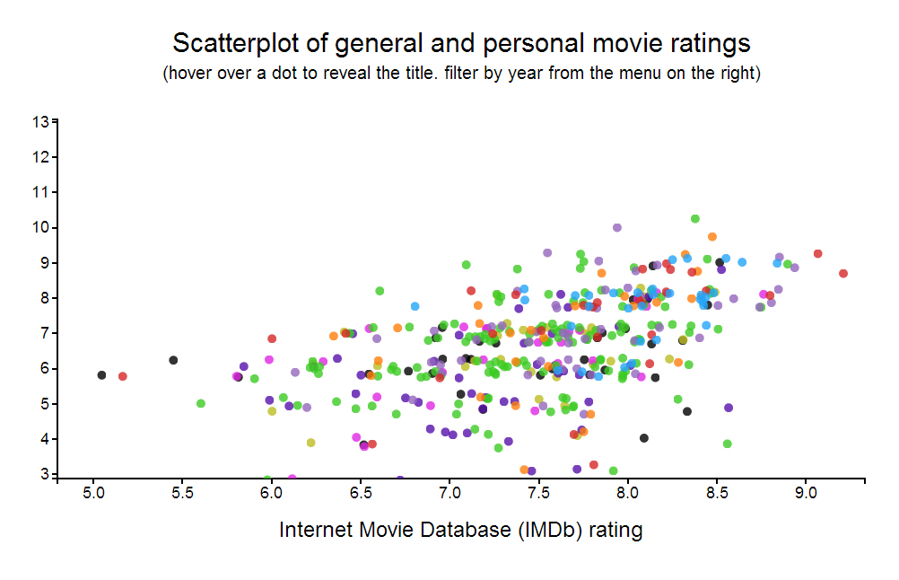
This project visualizes the relationship between personal and general movie tastes. It plots my own film ratings versus the ones provided by IMDb and based on the opinions of thousands of users. The visualization is interactive - you can see the scores of individual film titles, filter by year of release and genre, and search for a particular movie. You can get the small versions of the scatterplots here and a big one here.
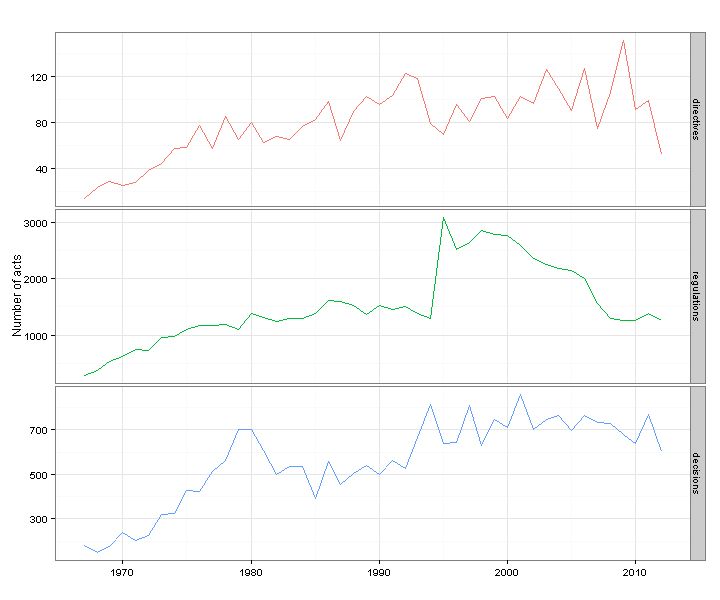
The EU has adopted more than 100 000 legal acts since its creation. This project presents the evolution of EU legislation over time. It shows the ups and downs in the number of legal acts adopted since 1967 according to type, author, policy area, etc. The full presentation is here. The data and R [ggplot2] scripts used to create the graphs are here.

This project creates a map of the artists in my last.fm music library. The similarity measures are taken from the site itself and I used igraph in R to visualize the resulting network. There are plenty of other music viz apps on the web, but none as personal as this. Details about the making of the graph can be found here. Click the image to the left to enlarge and explore.
This project creates a visualization of the social network in an academic organization - in this case, my own department. Using data on co-supervision of students, I reconstruct the network of affiliations between staff members. Understandably, only the anonymous version is publicly available. Details about the graph can be found here, and about the process of creation here
