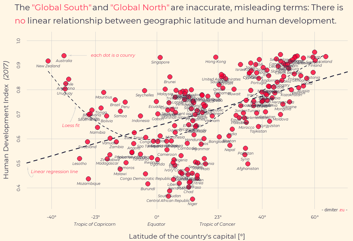
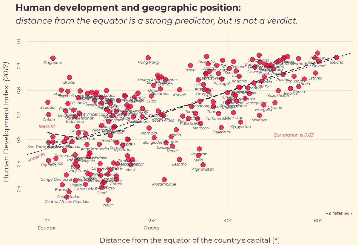
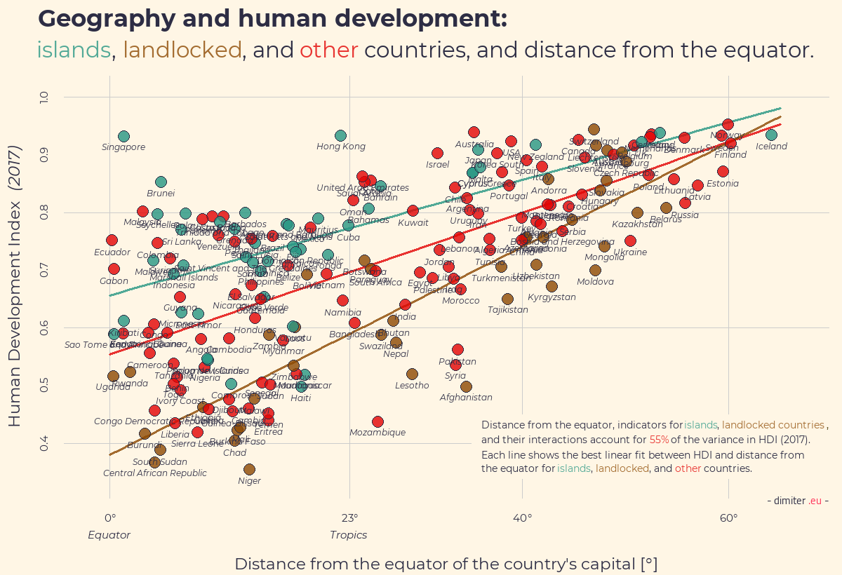
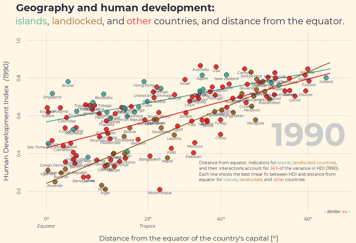
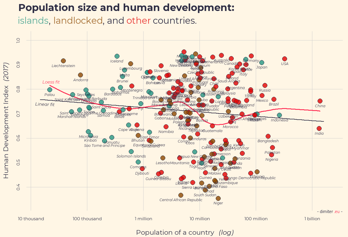
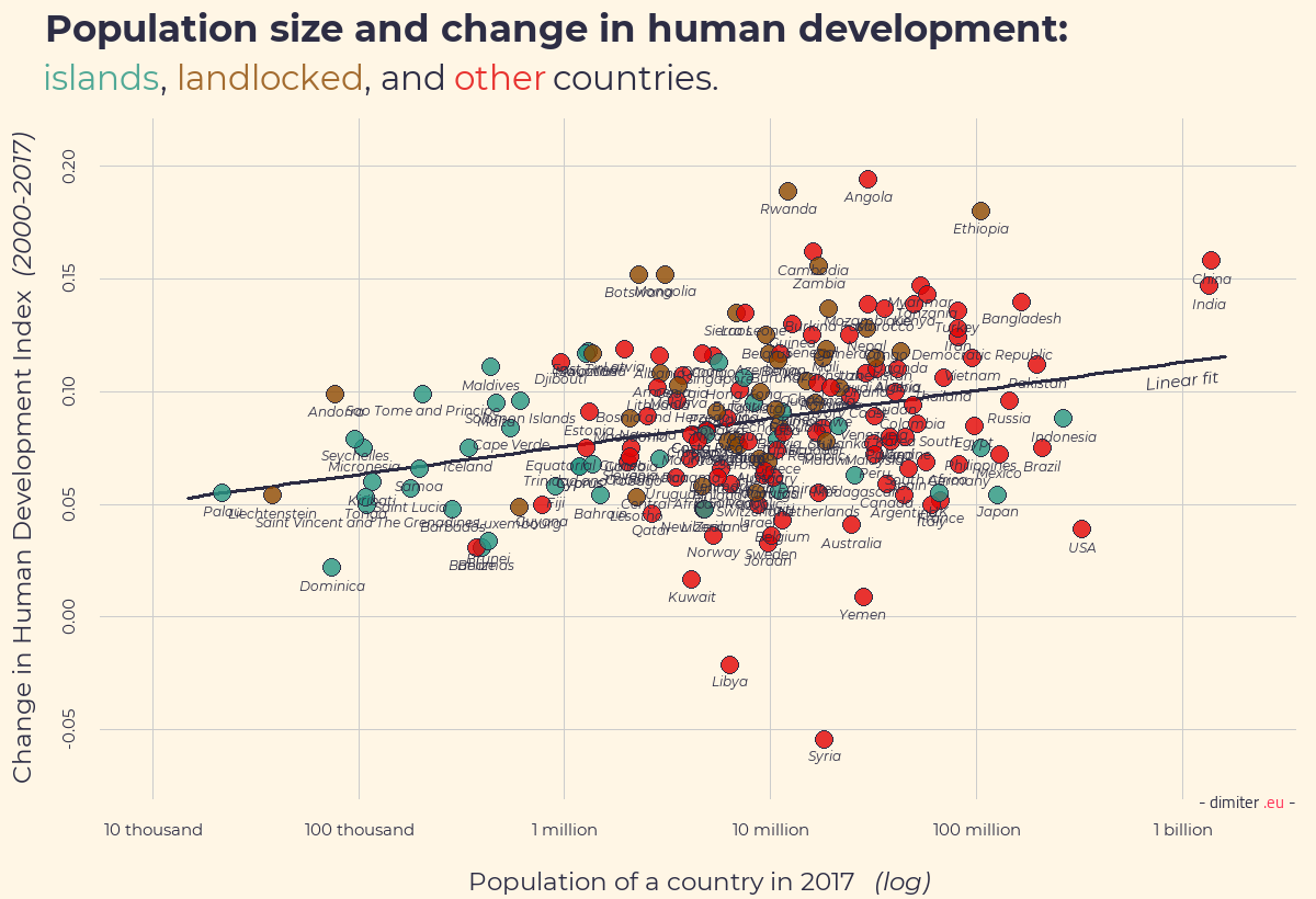
This series of graphs explore the political geography of human development. The first plot shows that the link between geographic latitude and development is not linear. The second plot shows that the distance from equator is a better predictor of HDI (Human Development Index), but it is not a deterministic one, as there is significant variation left. The third plot adds indicators for islands and landlocked countries and shows how these three variables account for more than 56% of the variance in HDI. The fourth plot is an animated gif that traces the strength of the link between geography and development over the past 30 years. As you can see, the link remains as strong. The fifth plot focuses on the link between population size and development: there is no evidence for one. However, as the last plot shows, since 2000 more populous countries have been, on average, better in raising their HDI.
For more context. you can see this blogpost and this follow-up. The code for the graphs is here. This is the datafile you need for replication.